Tags
A good friend of mine sent me a link to an animated gif that shows the popularity of baby names across the US over time [1]. The visualization uses the Social Security Administration records to display the most popular female name in each state from the early 1950s through present. It’s interesting to see how the top names spread across states and eventually decline in popularity. Unfortunately my name isn’t the correct gender nor popular enough to make an appearance. Fueled by equal parts ego and curiosity, I wanted to see how a single name spreads across the nation based on it’s prevalence in each state. For instance, a common name like Brian never tops the list but still has ebbs and flows of popularity that are interesting to track.
An Interactive Visualization
Hence I created a visualization that does just this. It uses the census data [2] from the early 1900s up until present, so any name present in that dataset can be visualized. There are more than 29,000 names available, not to mention some appearing in both genders. Instead of ranking the occurrences, I use the prevalence of a name (for a given gender and state) to determine the levels of the choropleth. The prevalence is thus binned into eight quantiles, plus a ninth for no data (i.e. 0 occurrences). This way you get a sense of the change in popularity of the name and how it spreads from state to state. This method provides deeper insights and more opportunities for exploration than simply viewing the top ranking names.
Geographic clustering
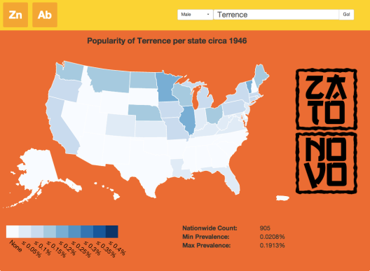
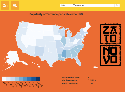
In fact, what is most interesting is to see how some names are popular in a specific geographic region while others are more broadly popular. Presumably the way names spread are governed by demographics, technology, and media. This is illustrated in the name Terrence, which is first popular in the Midwest in the 40s and 50s.
By the 80s, the name has declined in the Midwest and has become more popular in the South.
Media Influence
Other names are clearly influenced by media and popular culture. Go ahead and view the prevalence of Trinity (female) and Neo (male), both of which come onto the scene after the first Matrix movie. Similarly, the name River (male) becomes popular after the death of River Phoenix.
Gender Differences
Another insight is the difference in prevalence between the genders for a given name. Avery as a male name mostly appears in the South. By the 1950s it has spread North but not West. It isn’t until the late 1990s that the name has spread across most of the country.
Interestingly enough, the region that took the longest to be adopted is the same area where Avery is predominantly a female name. As a female name, it isn’t until the mid 1980s that the name becomes broadly considered a female name.
Other thoughts
I’m a sucker for inverse processes, so a natural follow up is to ask whether it is possible to predict age and state of birth based on a name. Some of the more unique names are so rare that you can deduce a person’s age and state of birth rather easily. Another question worth pursuing is what effect television had on the choice of names.
So what does all this mean for Brian? Sadly, Brian’s golden age was in the 70s and has been in decline ever since.
Implementation Notes
There’s nothing too fancy in this visualization. The visualization itself is implemented in d3.js, while the data was processed in R. The source data from the SSA is CSV format. I use my Odessa package to convert this to a JSON-compatible structure. The reason is that behind the scenes I use the RJSONIO package, which unfortunately marshals data.frames in column-major format. Here’s an example:
> toJSON(data.frame(x=c('a','b','c'), y=1:3))
[1] "{\n \"x\": [ \"a\", \"b\", \"c\" ],\n\"y\": [ 1, 2, 3 ] \n}"
Most JSON representations of table structures are row-major. In this format, an array represents the table where each element of the array is a JSON object. Each object represents a record/row in the table. Hence, in Odessa, I provide a function called row_major that does this conversion.
> toJSON(row_major(data.frame(x=c('a','b','c'), y=1:3)))
[1] "[\n {\n \"x\": \"a\",\n\"y\": \"1\" \n},\n{\n \"x\": \"b\",\n\"y\": \"2\" \n},\n{\n \"x\": \"c\",\n\"y\": \"3\" \n} \n]"
Odessa has a number of useful functions for data management. Coupled with the recently published lambda.tools, they provide a powerful paradigm for working with data.
References
[1] Map: Six Decades of the Most Popular Names for Girls, State-by-State
[2] Social Security Data


It looks very good. I like it.
Alain
LikeLike
Thanks Alain!
LikeLike
Great work!!
LikeLike
Pingback: NewsSprocket | List of Most Popular Baby Names and State of Origin
We love it. We’ve looked at the Social Security Administration baby names records loads. You’ve done a good job making them more useful / accessible!
http://www.babynames.biz
LikeLike
Thanks for the kind words. It’s amazing how rich the dataset is. Hopefully it helps show the value of open data as well.
LikeLike
Pingback: FOX NEWS UPDATE » Map uses census data to show how baby names spread
Pingback: Baby Names Map of Census Data by Brian Lee Yung Rowe of Zato Novo | TIME.com
came across some interesting new data visualization
http://blogs.scientificamerican.com/observations/2014/03/28/global-migrant-flows-an-interactive-map/
LikeLike
I have been fascinated for a number of years by how tv influences and is influenced by current name trends. Your data map was able to help me prove something I had been asserting for awhile. The name Madison which has been very popular recently as a girl’s name came from the Darryl Hannah character in the movie Splash. Both came out in 1984.
LikeLike